Subscribe for Access
Everything you need to know to design your integration listing pages on your first integration marketplace with tech partners.

Launching a tech marketplace is no easy feat. There’s a lot of moving parts — from determining who will build your integrations to developing your app marketplace UI. One of the most important pieces for launch day is making sure your integration listing pages on your website are user-friendly, engaging, and helpful to prospects and customers.
But who’s got time to search the web for the perfect frankensteinian amalgam of integration listing designs?
We’ve gathered examples of integration listing pages from 30+ tech companies, so you can get your dose of inspiration all in one fell swoop. Plus, we created a checklist of attributes you should include in your integration listings design (or redesign).
(And find our B2B SaaS partner page checklist here.)
Skip ahead:
- Your Integration listing pages checklist
- 30+ Integration listing page examples
Your integration listing pages checklist
Your name + your partner’s name (or logo)
This is a given, but look at how Box and ActiveCampaign do this differently in their listing pages design:

For each listing on Box’s tech marketplace, Box includes their name + a partner’s. They only include their partner’s logo in their tech marketplace directory.

ActiveCampaign includes their partner’s logo in its integration marketplace directory and in each listing page.
Description of your partner’s product and the value of the integration

Adobe Creative Cloud includes a super-short description of its integration with Microsoft Teams on its respective integration listing page (like in the above example with Microsoft Teams).

Here’s another example of an integration description on Shopify’s listing in Gladly’s integration marketplace.
System requirements and install instructions

Include system requirements and install instructions so your prospects can pass information along to their tech and leadership team about specific tech stack requirements. Your sales team can also copy and paste the listing URL into their sales emails to help accelerate the buying process.
How-to videos for setting up the integration

Walk your existing customers through the integration setup via a step-by-step video to eliminate the need for hand-holding from your customer success team and drive integration adoption faster.
Screenshots of the integration in action

Give your customers and prospects a taste of what the integration can do in action. Including screenshots is a great way to visually represent various use cases for the integration while allowing prospects to visualize how they would use the integration.
Integration use cases for customers

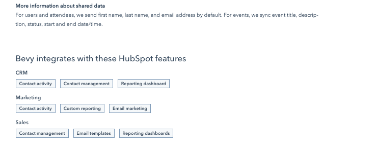
Include the top use cases for the integration on the listing page. HubSpot does just that and includes a list of additional HubSpot features their partner integrates with to expand their customers’ integration usage and adoption.

Link to a help center

Wike includes a dedicated link to a help center page from each integration listing page. The help center CTA above for Wrike’s Microsoft OneDrive integration links to the below help center page which details how to attach files from cloud storage apps to the project management tool.

Pricing
This can include pricing for your partner’s product, for the integration, or pricing for the subscription level required of your product in order to adopt the integration.

Reviews


Some integration listing pages include reviews and testimonials. If you choose to include reviews, you’ll likely need to make a concerted effort for your customer success team to gather reviews from early adopters. Then, make sure to establish a process going forward to continue gathering reviews from top integration users.
Links to related case studies

Include links to partner case studies so prospects and existing customers can see how others have used the integration and the metrics they’ve achieved as a result. Again, having supporting collateral for your integration in one place can make it easier for your sales reps to point their prospects to the right resources on the fly.

Integration release/version specs

Include your integration’s specs on the listing page so your prospects and customers can pass the URL directly to their security team for review.
Links to Documentation

CTA to get started, to ask for more information, or to get a demo

Related content

Include links to related content, like case studies, blog posts, and G2 reviews so your prospects and customers can go deep into the rabbithole to learn more about your integration, your product, and your company.
And now, the inspiration gallery:
30+ integration listing page examples
Bonjoro


Box

ServiceNow


Seismic

Adobe Exchange


Typeform

HubSpot


ActiveCampaign


Salesforce


(Check out how ActiveCampaign’s co-marketing playbook for getting the #1 spot for marketing automation apps on Salesforce AppExchange)
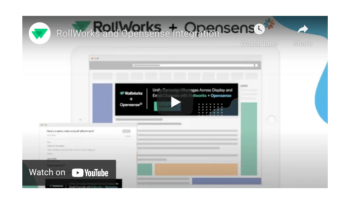
RollWorks

Zapier

Sendoso


Bombora


6sense


Twilio


Split.io


Litmus


Oracle


Gladly


Slack


Wrike


Allocadia

Monday.com


BigCommerce


Trello


Marketo

Crossbeam

Zoom


Vidyard


Marker.io


Yotpo


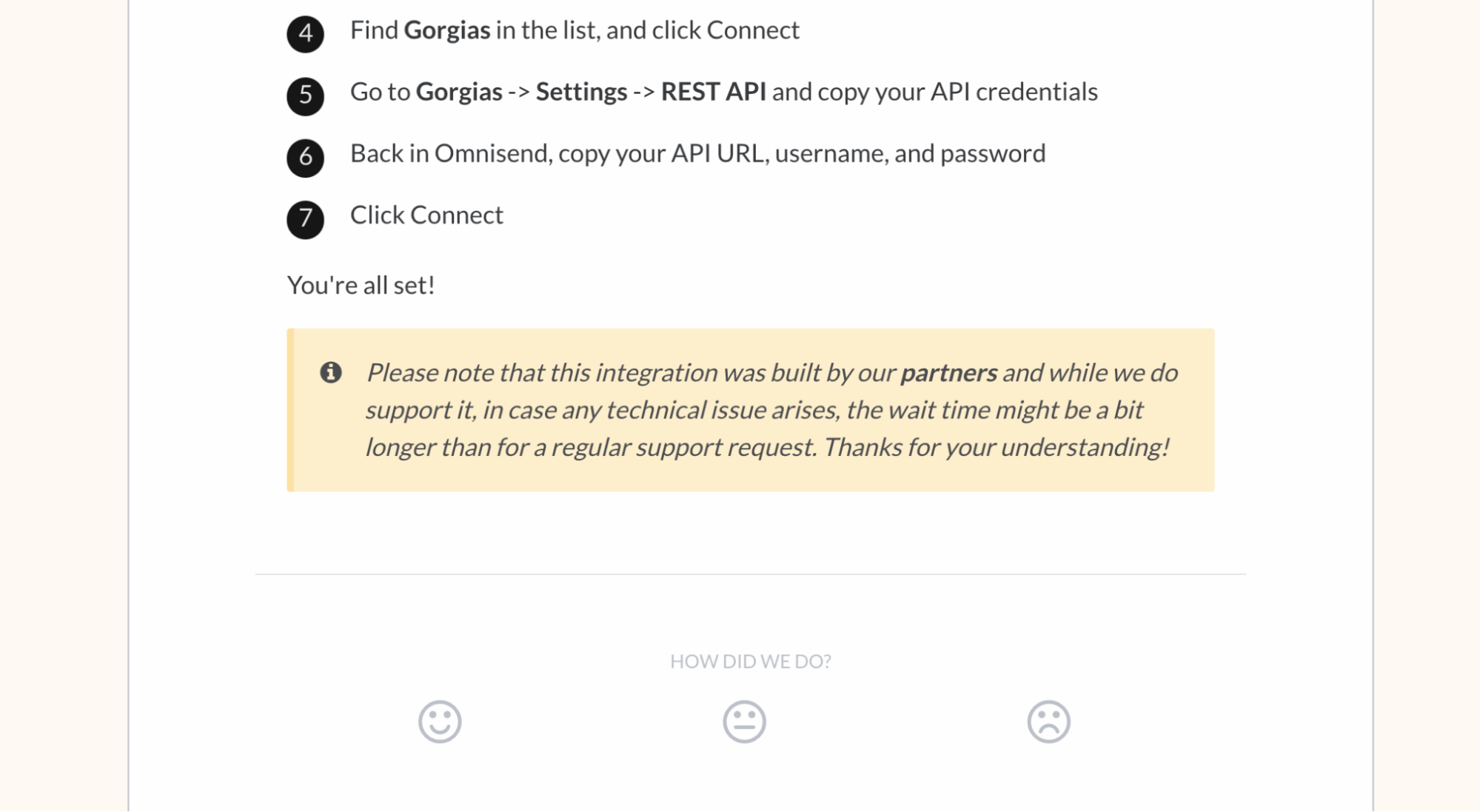
Gorgias

Smooch.io

Asana


—
Whew! We hope you found bits and pieces of these integration listing pages to adopt for your integration marketplace design. If you’re launching a tech ecosystem for the first time, take a look at our step-by-step recap of how we launched our tech marketplace with 30+ integrations in June 2020.
You may also enjoy:


%20(1).jpg)


.png)




.jpg)


.png)





.jpg)


.jpg)

.webp)


.webp)


