Your B2B SaaS Partner Page Checklist (with 50 Examples)
Your B2B SaaS Partner Page Checklist (with 50 Examples)

By Sean Blanda
October 12, 2020
Note: This post was originally published on 5/5/2020 and was updated on 10/12/2020.
Why hello there. Welcome to the Crossbeam Art Museum, where we feature the finest designs in all of the SaaS partner ecosystem. In today’s collection, we’ll be focusing on the front door of your partner program: your partner page.
In order to scale and avoid handling inbound partner requests one at a time, many mature partner programs will have a dedicated website for potential channel, integration, and agency partners (among others) to learn more about joining their partner ecosystem.
If you’re thinking about creating or updating your partner page it helps to know what other members of the partner ecosystem are including on their pages. Let’s do a quick review, with examples:
Partner page redesign checklist:
We’ve reviewed dozens of partner pages and most contain the same major elements:
Link to apply for partnership

Typically, the primary CTA on a partner page is a link to a form or email address that allows the user to get the attention of the partnerships team. The example above, from Voxy, scrolls the form elsewhere on the page.
Sub pages for resellers, integration, etc.

“Partnership” has varying meanings, so route your visitor to the right place. Most partner pages, like Chargify above, have sub pages for each variety of partnership they offer, which helps you sort through the chaos and all of the different naming conventions. Now if we could just do something about those job titles…
JOIN US ON CROSSBEAM Button

Crossbeam customers, like our friends at Clearbit, can offer an easy way for partners to connect with them on Crossbeam and start sharing data overlaps — it’s perfect for super-fast partner vetting and onboarding. Learn how to get your own button here.
Case studies and news

Usually a feed from a marketing blog, many partner pages surface extra details about their partner programs, like Mixpanel does above.
List of logos of existing partners and integrations

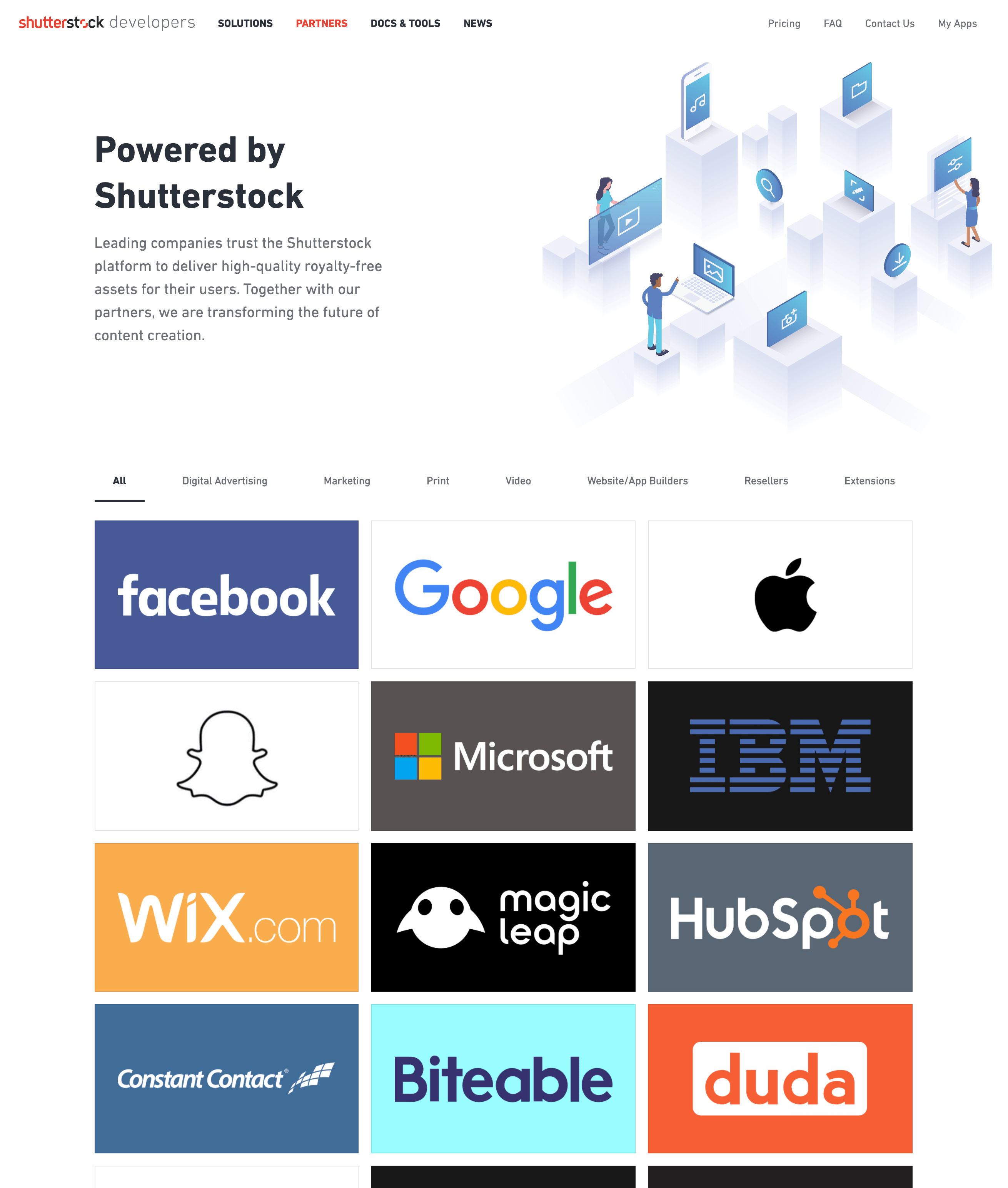
There are three kinds of social proof on partner pages. One approach, like the above example from Shutterstock, is to include the logos of prominent partners. Another is…
Testimonials from partners with headshots

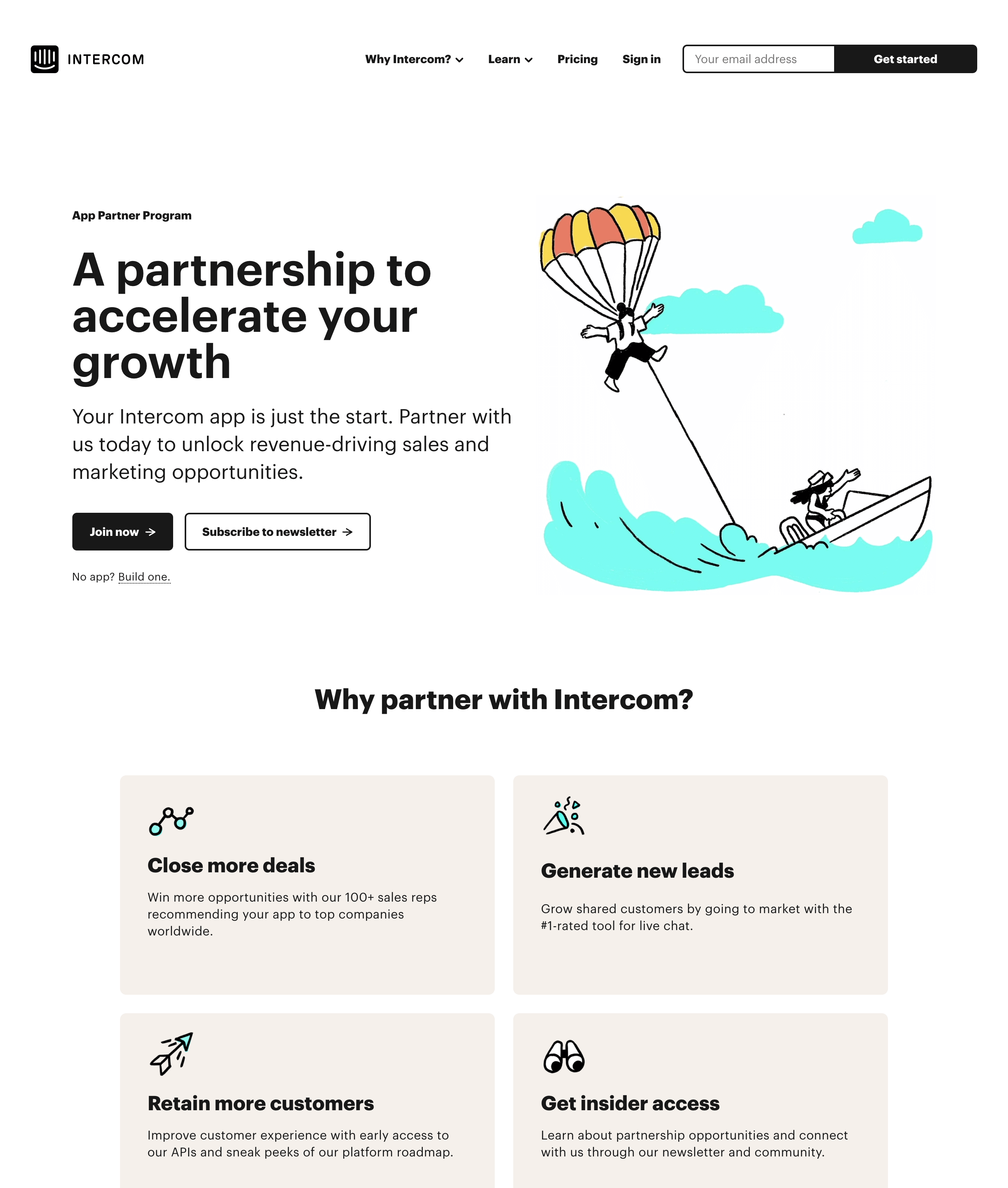
Your partner page is a sales page — and a good sales page offers testimonials from customers, like Intercom does above. The third approach is…
Video TESTIMONIAls from partners

Some partner pages—like KnowBe4, DropBox, and Mailchimp—feature video testimonials with partners sharing stories about how the partnership helped grow their business.
On Mailchimp’s agency partner page, its agency partners rave over benefits like getting access to priority support, gaining brand exposure, and acquiring more leads.
List of partner benefits

Many partner pages, like Datadog, use icons to call out a list of unique benefits for their partner program. The benefits vary by partnership type, but typically include access to the partner’s audience, marketing and dev support, and some kind of revenue share.
Partner TiErS

Larger partner programs like Zapier above, have to prioritize resources. As a result, they often feature their partner tiers to incentivize partners and allow them to focus on top performing partnerships.
Link to the partner portal

Some partner programs combine their partner portal log in with their partner marketing pages like Looker.
The gallery
So to help spur your imagination and give you plenty of links to share with your design team, we present our ever-updating list of partner pages. Take a walk with us…
Chargify

Snowflake

Procore

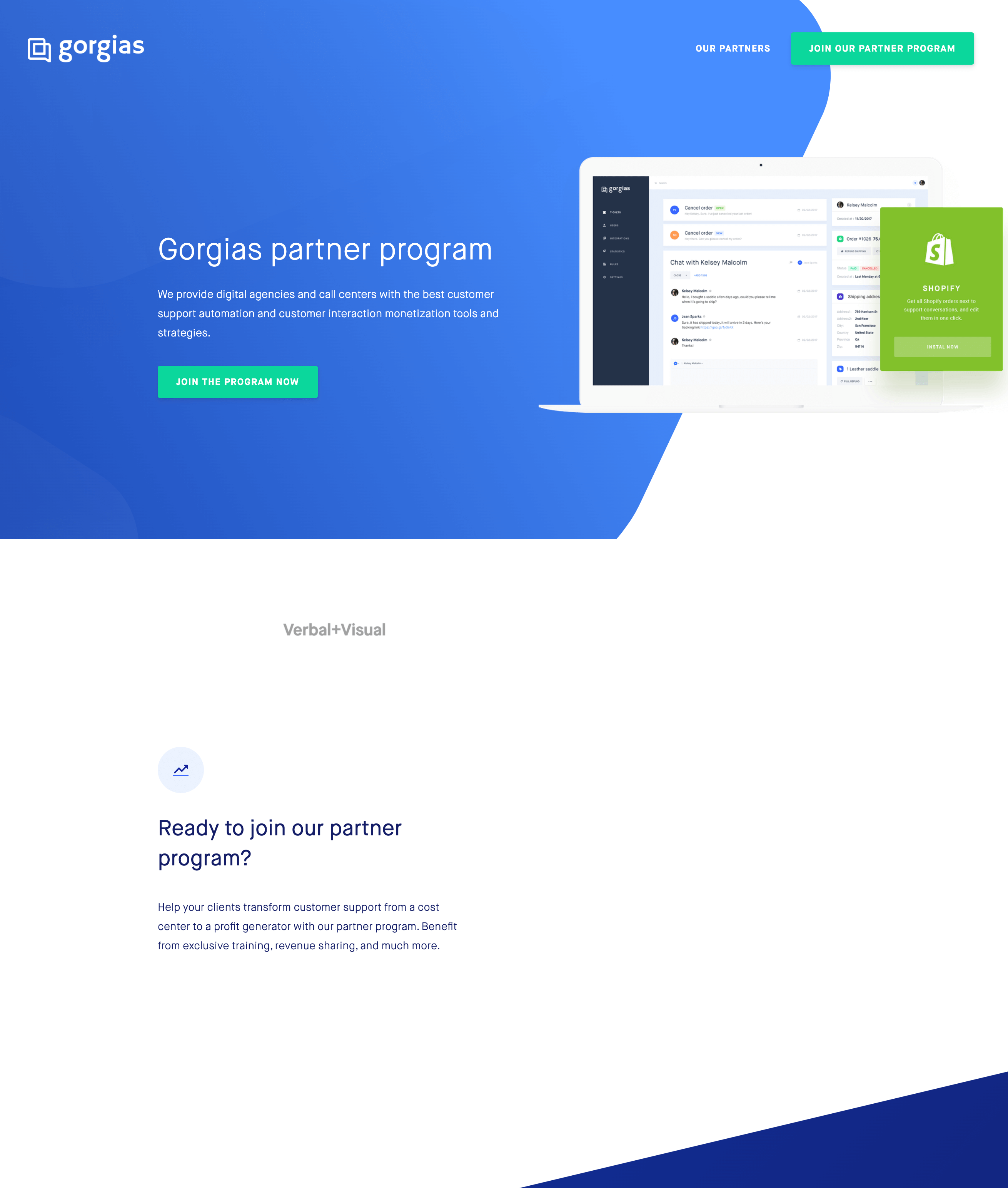
Gorgias
HubSpot

Datadog

Segment

Voxy

Slack

WordPress VIP

Tray.io

Vidyard

ActiveCampaign

Crownpeak

Zenefits

Drift

Intercom
Shutterstock
Looker

Typeform

RingCentral

Zendesk

Zapier

Stitch

Checkr

HootSuite

Mixpanel

Shopify

Mailchimp

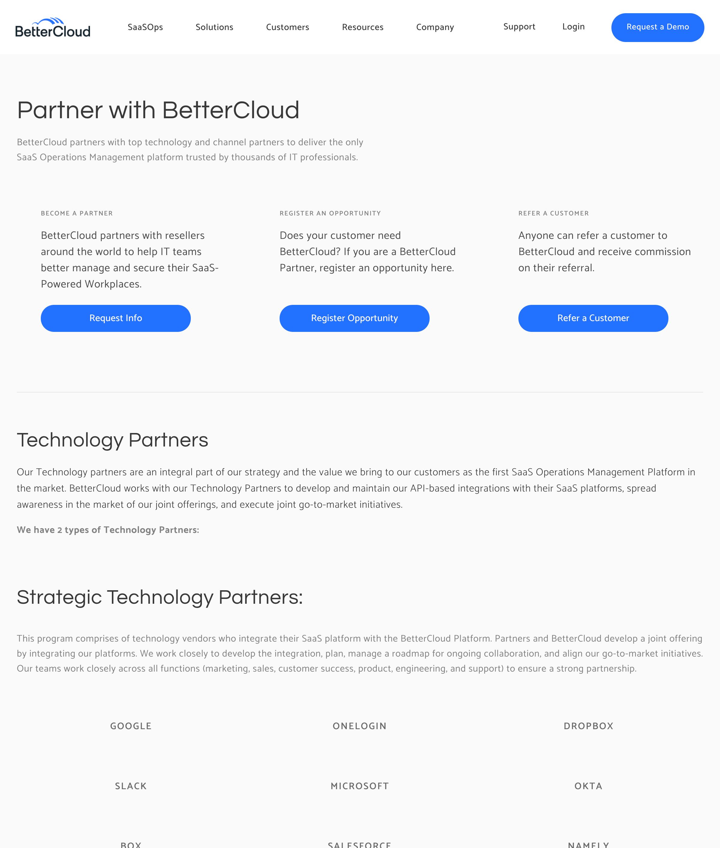
BetterCloud
Mailjet

monday.com

Human Interest

Bombora

Twilio

BigCommerce

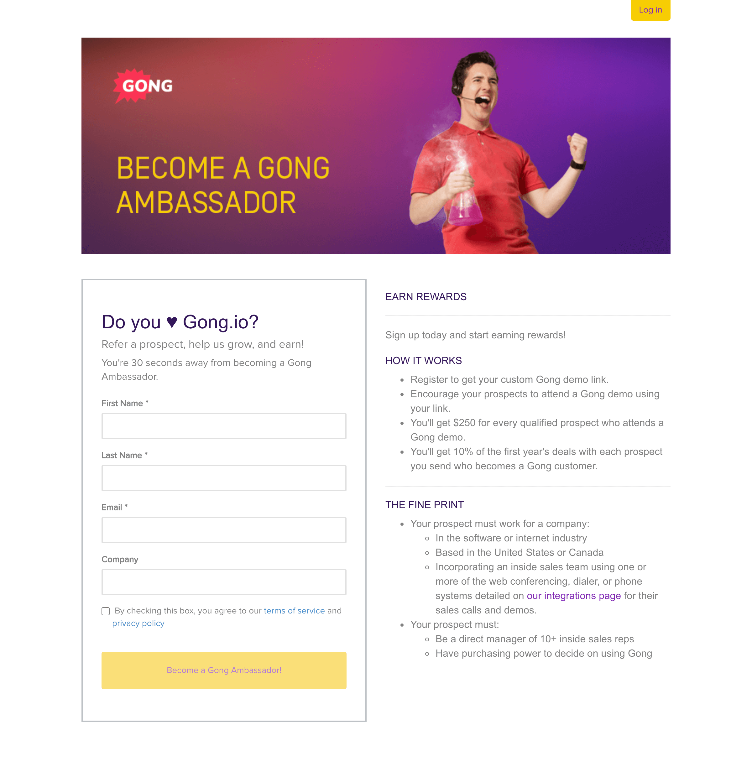
Gong
FreshBooks

ShipStation

Drip

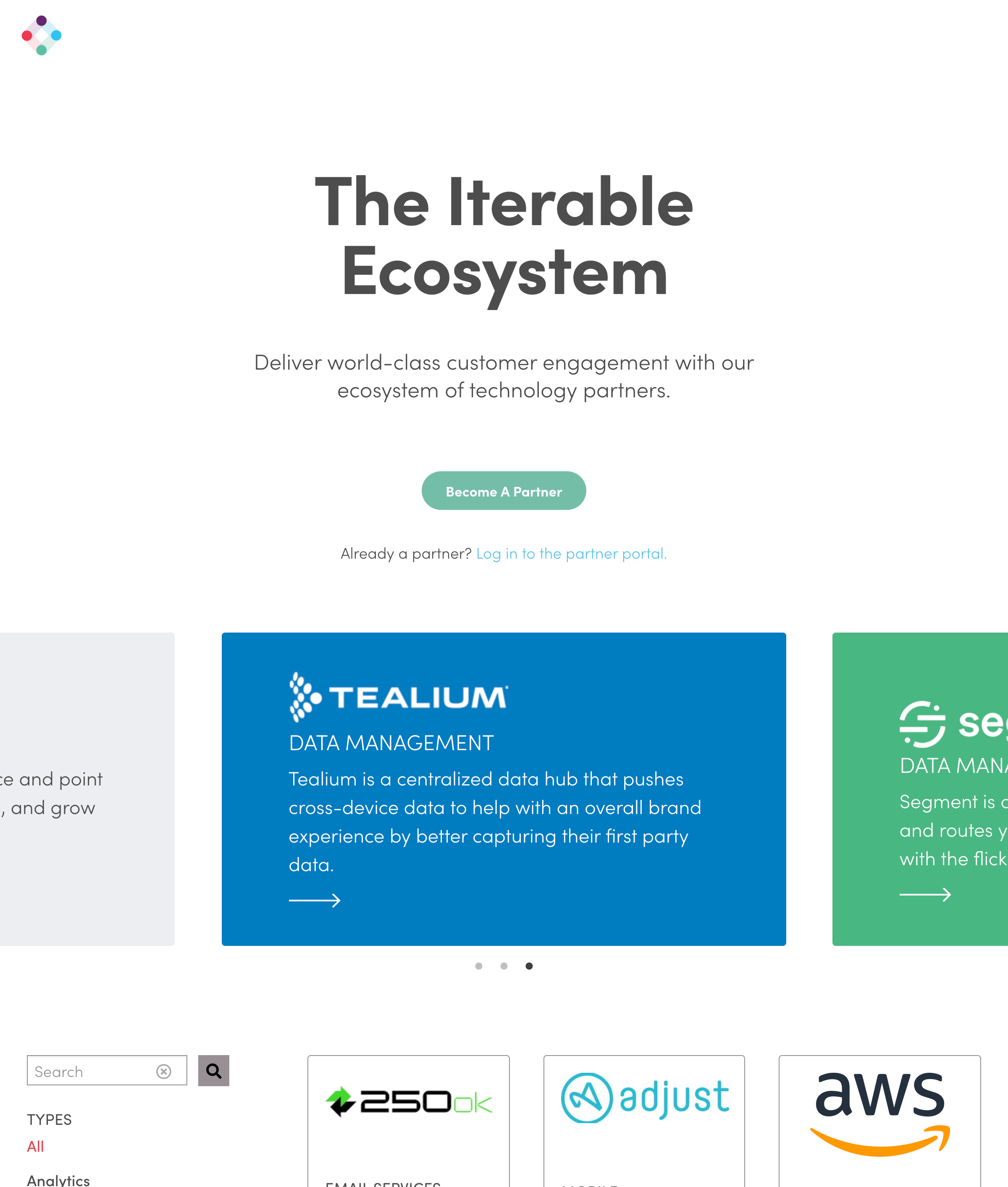
Iterable
Stripe

Square

Wrike

Asana

Dropbox

6sense

Amplitude

KnowBe4

Attentive















.jpg)






%20(1).jpg)





.png)











.jpg)


.png)




.jpg)


